Property price prediction

In this tutorial, you will learn:

  • The basics in macroeconomic analysis
  • The ways of analyzing macroeconomic indicators
  • The ways of analyzing real estate market data
  • How to build a property price prediction model

Intro to macroeconomic analysis

As we have discussed in the first tutorial, macroeconomic analysis is a way of investigating the macroeconomic indicators that influence the stock market.
In this module, we will first analyze the macroeconomic indicators and explore how the indicators affect the stock prices in Hong Kong.
Then, we will specifically analyze the Hong Kong real estate market, as we believe that it is one of the most important macroeconomic indicator that can reflect the Hong Kong’s economy.
In addition, we will build a property price prediction model to predict the house price of Hong Kong.

Macroeconomic indicators in Hong Kong

Before proceeding, first import some necessary libraries needed for this module.
import random
import pandas as pd
import matplotlib.pyplot as plt
import seaborn as sns
import pandas as pd
import numpy as np
from sklearn.model_selection import train_test_split
from sklearn.preprocessing import LabelEncoder
After importing the libraries, let’s have a look at the data. The data contains 8 different macroeconomic indicators collected from 2016 to 2020.
Use df.info() to print information of all columns.
"Macroeconomic data."

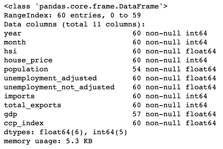
The column information of macroeconomic data.

Univariate analysis

In univariate analysis, use pandas.Dataframe.describe() to examine the distribution of the numerical features. It returns the statistical summary such as mean, standard deviation, min, and max of a data frame.
For a better understanding of the statistics summary, use seaborn.distplot() to visualise the results with histograms.
# Statistical summary
print(df[feature_name].describe())

# Histogram
plt.figure(figsize=(8,4))
sns.distplot(df[feature_name], axlabel=feature_name);

Bivariate analysis

In bivariate analysis, we are going to study the correlations between a macroeconomic indicator and the Hang Seng Index. Use matplotlib.pyplot.scatter() and seaborn.regplot() to visualize the relationship between two features.
x = df[feature_name]
y = df['hsi']

plt.scatter(x, y)
plt.xticks(rotation=45)
fig = sns.regplot(x=feature_name, y="hsi", data=df)
"Scatter graph with regline."

An example of a scatter plot with a regression line.

Then, use 
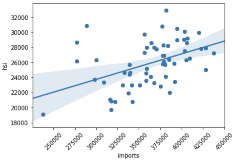
pandas.Dataframe.corr() and seaborn.heatmap() to compute a pairwise correlation of features and visualize the correlation matrix.
fig, ax = plt.subplots(figsize=(10,10))
cols = df.corr().sort_values('hsi', ascending=False).index
cm = np.corrcoef(df[cols].values.T)
hm = sns.heatmap(cm, annot=True, square=True, annot_kws={'size':11}, yticklabels=cols.values, xticklabels=cols.values)
plt.show()
"Heatmap - macroeconomic indicator."

Heatmap - macroeconomic indicators of Hong Kong.

According to the above figure, we can see that house price, GDP, population, imports, composite consumer price index , total exports, and year are positively correlated to the Hang Seng index, while both seasonally adjusted unemployment rate and not seasonally adjusted unemployment rate are negatively correlated to the Hang Seng index.

The Hong Kong real estate market

As shown above, the house price in Hong Kong has a strong positive correlation with the Hang Seng Index. In fact, the properties and construction sector accounts for over 10% of weighting in the Hang Seng Index (Hang Seng Indexes Company Limited, 2020), and thus the real estate market data is a source of volatility in the Hong Kong stock market.
While Hong Kong’s real estate market is a constant topic of discussion, it will be worth analyzing the Hong Kong real estate market data. Using the same data analysis technique used for the above analysis, we will now analyze Hong Kong residential market transaction records.

Data pre-processing

Before analyzing the transaction records:

1. Derive some useful features from existing features.

# Add new features
df['month'] = pd.to_datetime(df['RegDate']).dt.month
df['year'] = pd.to_datetime(df['RegDate']).dt.year

2. Drop unmeaningful features and features with too many missing values

# Drop unnecessary columns
df = df.drop([feature_name], axis=1)

3. Handle missing values by replacing NAN with a mean value of a feature

# Handling missinig values
# Fill with mean
feature_name_mean = df[feature_name].mean()
df[feature_name] = df[feature_name].fillna(feature_name_mean)
  1. Label encode categorical features
le = LabelEncoder()
le.fit(list(processed_df[feature_name].values))
processed_df[feature_name] = le.transform(list(processed_df[feature_name].values))

Economic indicator analysis

In economic indicator analysis, we will explore how the macroeconomic indicators affect the monthly average house price per saleable area in Hong Kong.
The transaction records from Centaline Property will be used for this analysis.
"Transaction records - Centaline Property"

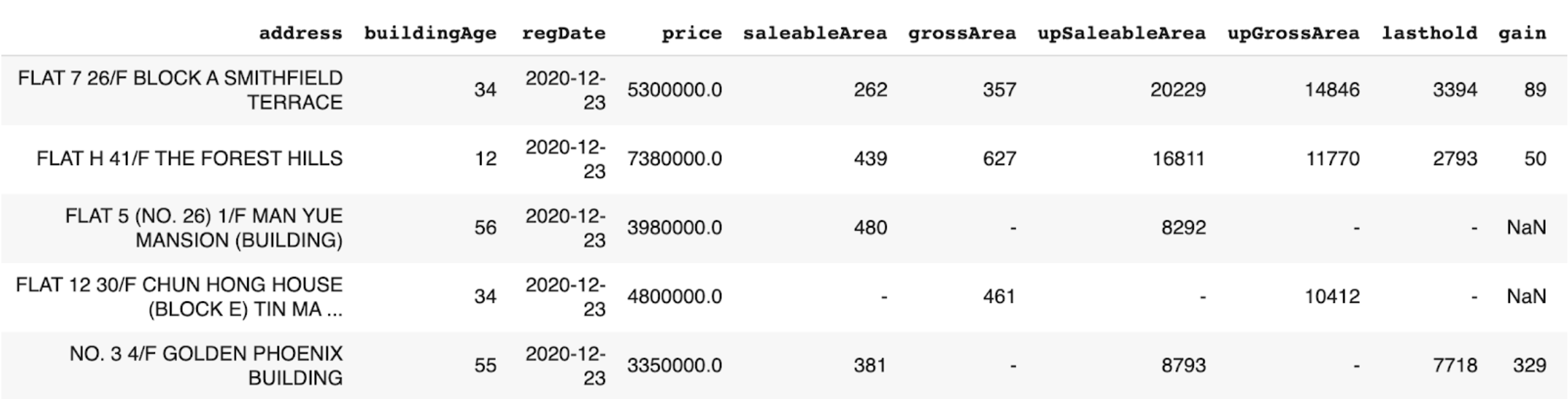
The data structure of transaction record (Centaline Property).

Before analyzing the data, calculate the monthly average house price per saleable area. Then, join the data with economic indicators by year and month.
# calculate the monthly average house price
df = df.groupby(['year','month'],as_index=False).mean()
df = df.rename(columns={'UnitPricePerSaleableArea': 'AveragePricePerSaleableArea'})
Using the bivariate analysis method we learned, a pairwise correlation of features is computed and visualized. The result shows that population, year, composite consumer price index, GDP, imports, and total exports are positively correlated to the monthly average house price per saleable area in Hong Kong, while both unemployment rates are negatively correlated to the monthly average house price per saleable area in Hong Kong.
"Heatmap - economic indicator analysis"

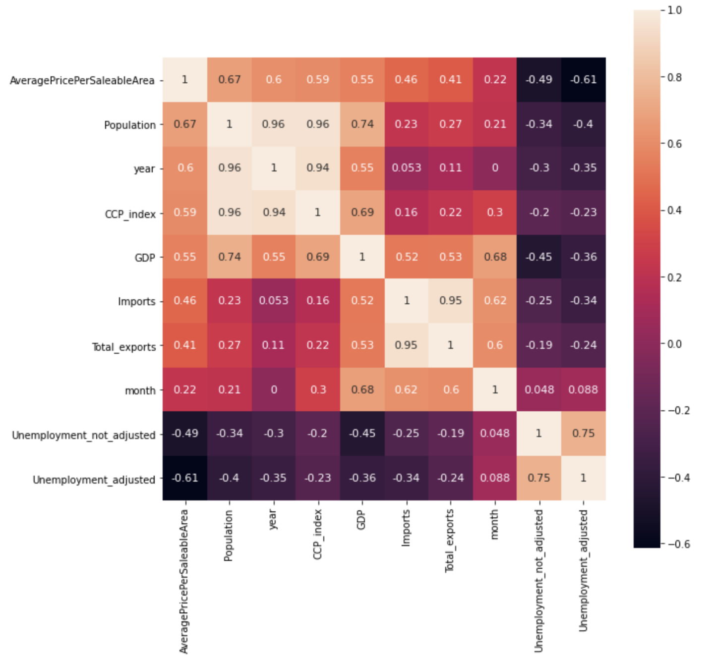
Heatmap - economic indicators analysis.

Transaction record analysis

In transaction record analysis, we will examine the relationship between features describing the house and the individual housing prices of Hong Kong.
The transaction records from Midland Realty will be used for this analysis.
"Transaction records - Midland Realty - Part 1"

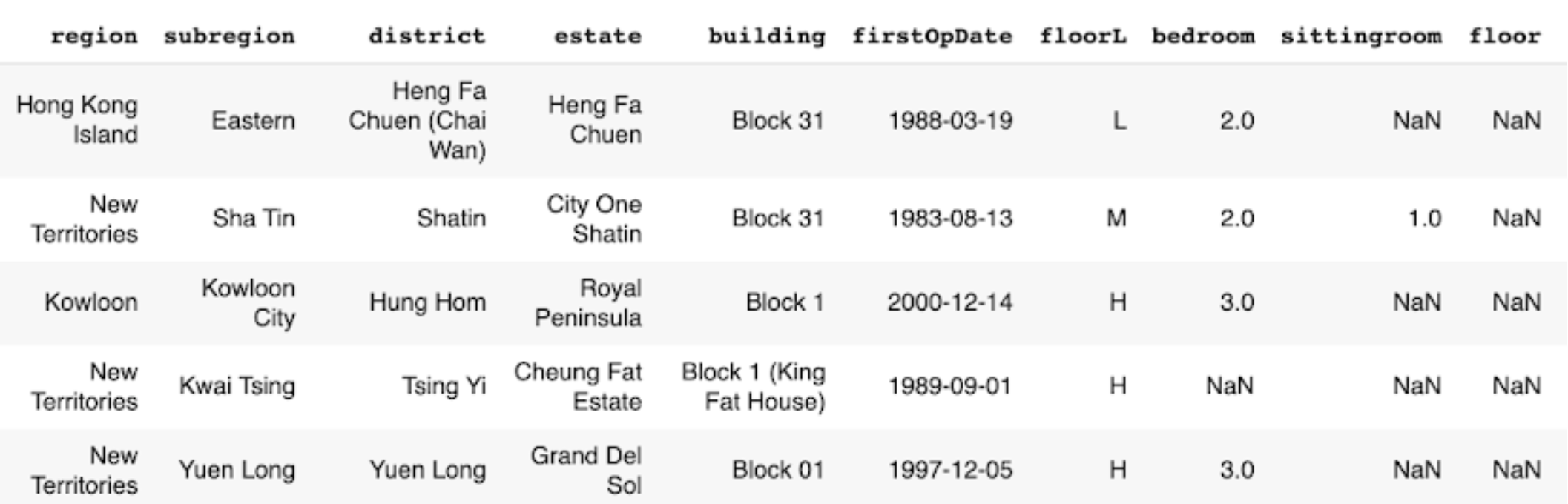
The data structure of transaction record (Midland Realty) - Part 1.

"Transaction records - Midland Realty - Part 2"

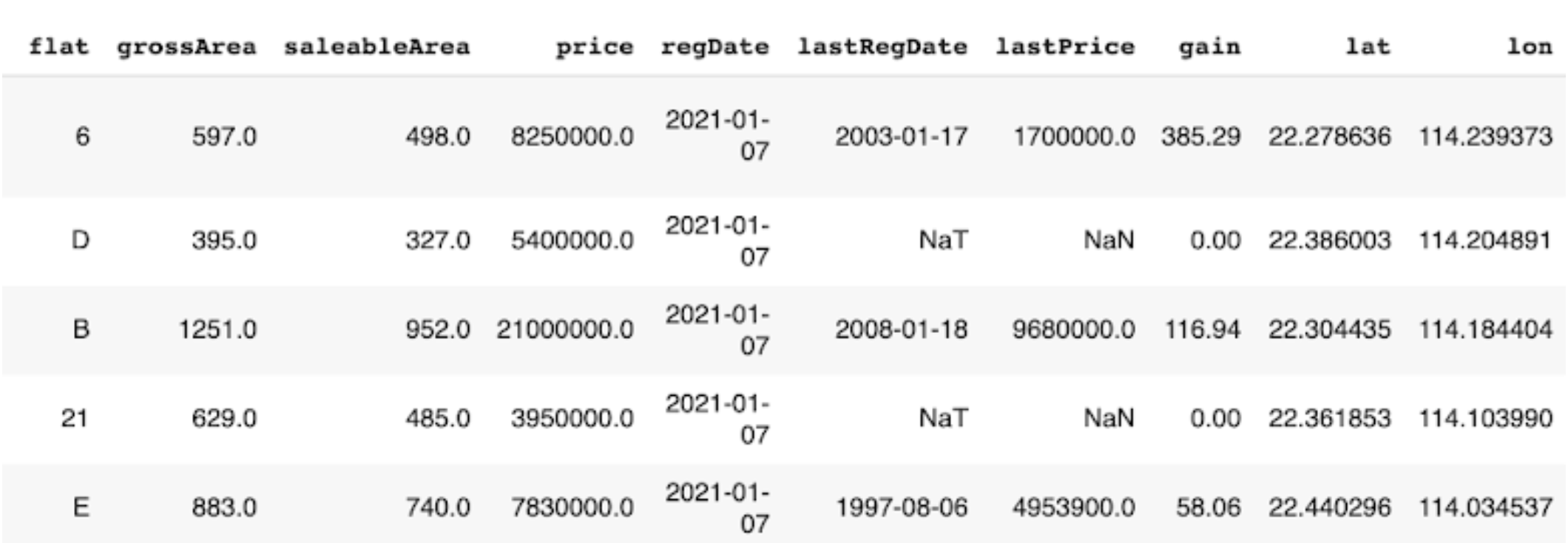
The data structure of transaction record (Midland Realty) - Part 2.

In univariate analysis, the distribution of Hong Kong’s house price is examined. The housing price of Hong Kong has a mean of 9 million HKD and a standard deviation of 13 million HKD. The skewness and kurtosis were 26.9 and 1526.4 respectively, showing that the housing price of Hong Kong is skewed positively to a very high degree.
# Distribution
print(df['price'].describe())

# Skewness and kurtosis
print("Skewness: ", df['price'].skew())
print("Kurtosis: ", df['price'].kurt())
#output:

count    1.664090e+05
mean     9.133268e+06
std      1.310856e+07
min      5.500000e+05
25%      5.200000e+06
50%      6.830000e+06
75%      9.500000e+06
max      1.399000e+09
Name: price, dtype: float64

Skewness:  26.927207752922435
Kurtosis:  1526.4066673335874
In order to get a better result for the bivariate analysis, outliers are removed by using standard deviation.
# Calculate mean and standard deviation
data_mean, data_std = np.mean(df[feature_name]), np.std(df[feature_name])

# Calculate upper boundary
upper = data_mean + data_std * 3

# Remove outliers
df = df[df[feature_name] < upper]
In bivariate analysis, the correlation coefficient between the features describing the house and the house price is computed. 7 features with the highest correlation is selected and shown below.
"Heatmap - transaction data analysis"

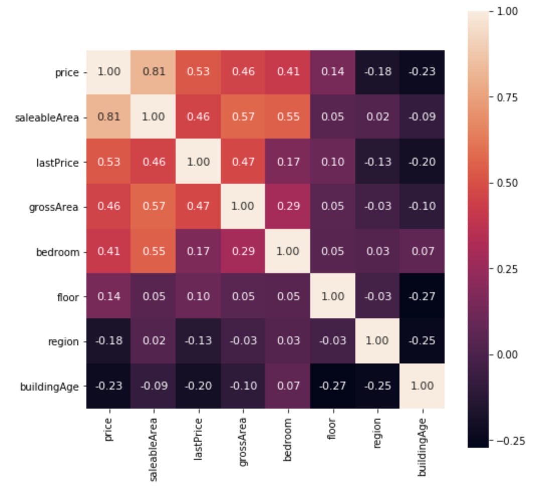
Heatmap - transaction data analysis.

According to the above figure, the housing price in Hong Kong has (1) a strong positive correlation with saleable area; (2) a moderate positive correlation with last transaction price; (3) a moderate positive correlation with gross area; (4) a moderate positive correlation with number of bedrooms; (5) a weak positive correlation with floor; (6) a weak negative correlation with region; and (7) a weak negative correlation with building age.
The full implementation of the economic indicator analysis and transaction data analysis could be found in code/macroeconomic-analysis/ in the repository.

Property price prediction with machine learning

Based on the transaction data analysis, let’s build property price prediction models.

Train-test split

Use sklearn.model_selection.train_test_split() to split the data with the ratio of 8:2. The input variables are the top 7 features selected from the analysis, and the output feature is the house price.
feat_col = [ c for c in df.columns if c not in ['price'] ]
x_df, y_df = df[feat_col], df['price']

x_train, x_test, y_train, y_test = train_test_split(x_df, y_df, test_size=0.2, random_state=RAND_SEED)

Log transformation

Before training the model, transform y_train using log function to normalise the highly skewed price data. In this way, the dynamic range of Hong Kong’s property price can be reduced.
log_y_train= np.log1p(y_train)

Training the model

In total, 4 different types of predictive models will be built:
  1. XGBoost
  2. Lasso
  3. Random Forest
  4. Linear Regression
Train the models with x_train and y_train, and use the models to make the predictions.
import xgboost as xgb

# XGBoost
model_xgb = xgb.XGBRegressor(objective ='reg:squarederror',
                      learning_rate = 0.1, max_depth = 5, alpha = 10,
                      random_state=RAND_SEED, n_estimators = 1000)
model_xgb.fit(x_train, log_y_train)
xgb_train_pred = np.expm1(model_xgb.predict(x_train))
xgb_test_pred = np.expm1(model_xgb.predict(x_test))

Evaluate accuracy

Then, evaluate the performance of each model by root mean square log error (RMSLE). The reason why RMSLE is used is because the price values are too big, and RMSLE prevents penalising large differences between actual and predicted prices.
from sklearn.metrics import mean_squared_log_error

def rmsle(y, y_pred):
  return np.sqrt(mean_squared_log_error(y, y_pred))
#output:

    XGBoost RMSLE(train):  0.1626671056150446
    XGBoost RMSLE(test):  0.16849945199484243
The train model RMSLE and the test model RMSLE are 0.1627 and 0.1685 respectively. XGBoost uses a more accurate implementation of gradient boosting algorithm and optimised regularisation, and hence, it gives a better result than other models.
However, in this case, the result shows that the model is slightly overfitting the train data. The below figure shows the graph of actual and predicted property price for XGBoost.
plt.figure(figsize=(5,5))
plt.scatter(y_test,xgb_test_pred)
plt.xlabel('Actual Y')
plt.ylabel('Predicted Y')
plt.show()
"The prediction graph for XGBoost."

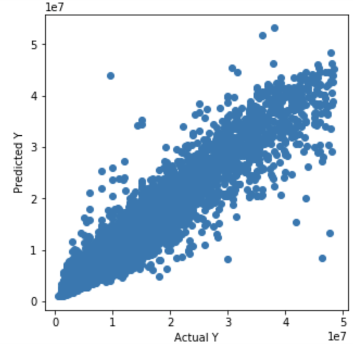
The graph of actual and predicted house price for XGBoost.

Attention

All investments entail inherent risk. This repository seeks to solely educate people on methodologies to build and evaluate algorithmic trading strategies. All final investment decisions are yours and as a result you could make or lose money.