Technical analysis
In this tutorial, you will learn:
The basics of technical analysis
Technical analysis charts
What are the common technical indicators
How to implement technical indicators
Intro to technical analysis
In general, technicians consider the following types of indicators:
Price trends
Chart analysis
Volume indicators
Momentum indicators
Oscillators
Moving averages
Requirements:
Chart analysis
Definition
Line chart
plt.style.use('ggplot')

# Initialise the plot figure
fig = plt.figure()
fig.set_size_inches(18.5, 10.5)

ax1 = plt.subplot2grid((6,1), (0,0), rowspan=5, colspan=1)
ax2 = plt.subplot2grid((6,1), (5,0), rowspan=1, colspan=1, sharex=ax1)

df['50ma'] = df['Close'].rolling(window=50, min_periods=0).mean()
df.dropna(inplace=True)

ax1.plot(df.index, df['Close'])
ax1.plot(df.index, df['50ma'])
ax2.bar(df.index, df['Volume'])

plt.show()
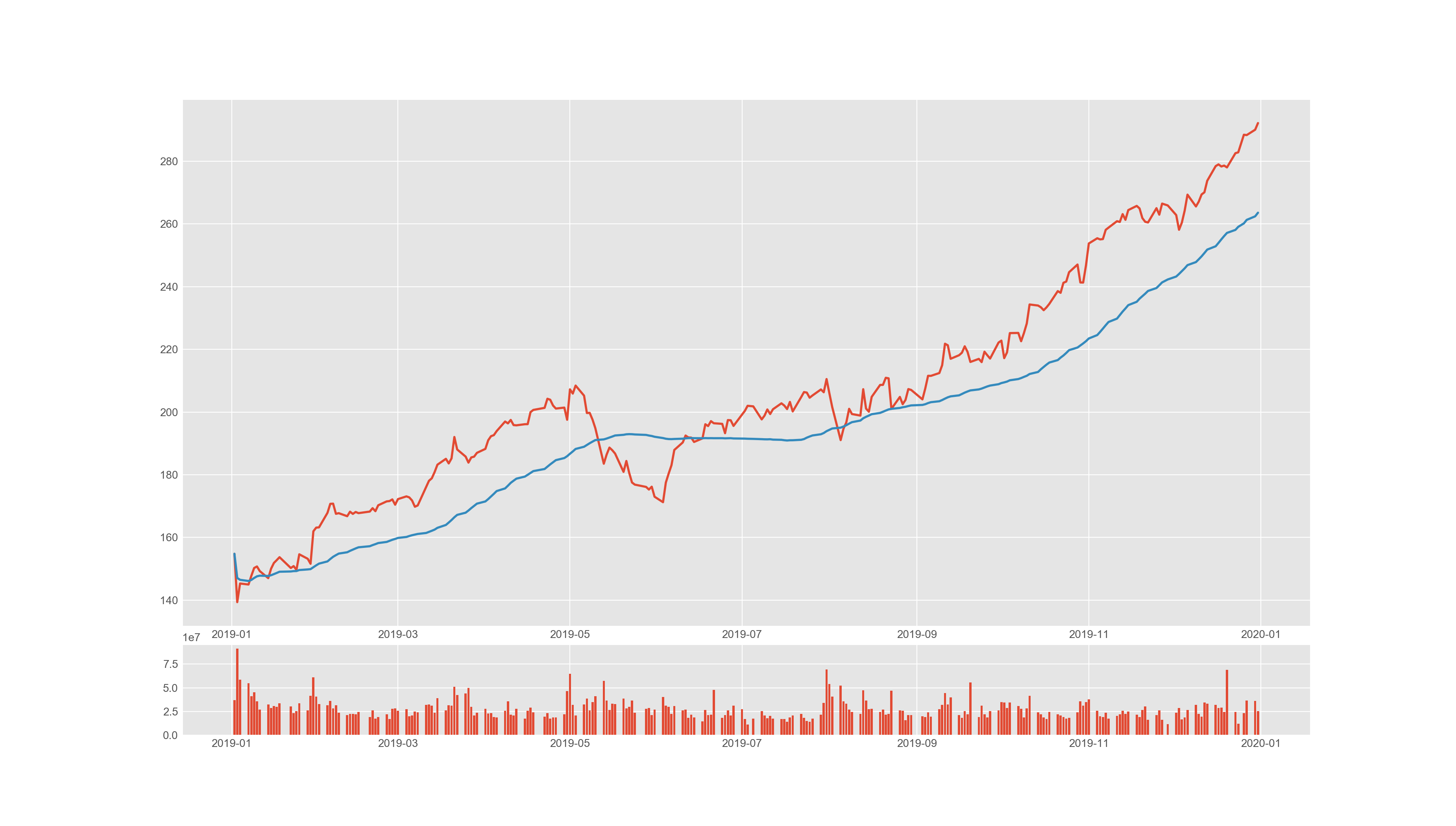
Example of a line chart and a bar chart showing price and volume changes respectively.
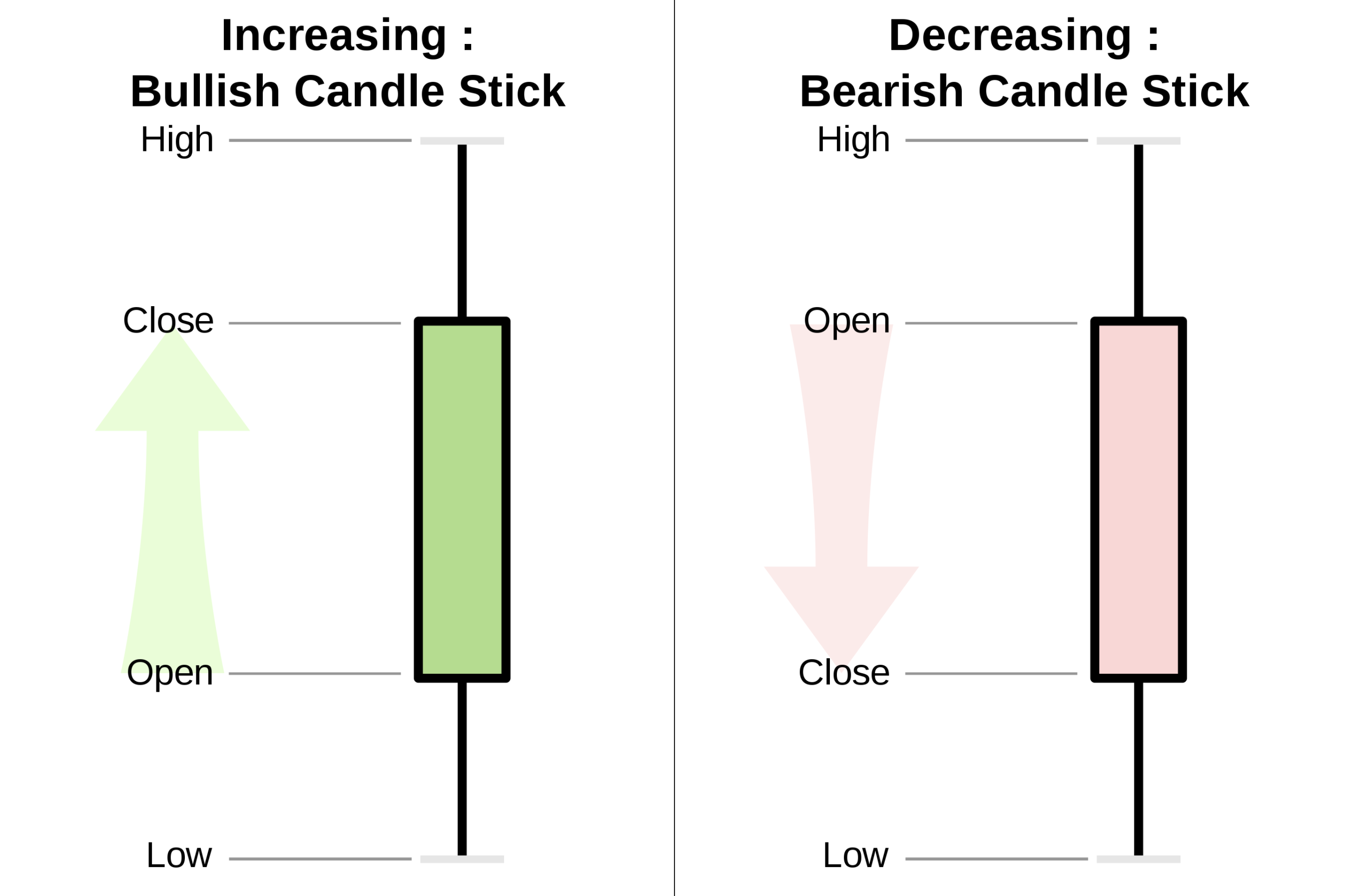
Candlesticks chart
mpl_finance to plot candlestick charts:fig = plt.figure()
fig.set_size_inches(18.5, 10.5)
ax1 = plt.subplot2grid((6,1), (0,0), rowspan=5, colspan=1)
ax2 = plt.subplot2grid((6,1), (5,0), rowspan=1, colspan=1, sharex=ax1)
# plot candlesticks
mpl_finance.candlestick_ohlc(ax1, data, width=0.7, colorup='g', colordown='r')
ax.grid() # show grids
############# x-axis locater settings #################
locator = mdates.AutoDateLocator() # interval automically set
ax1.xaxis.set_major_locator(locator) # as as interval in a-axis
ax1.xaxis.set_minor_locator(mdates.DayLocator())
############# x-axis locater settings #################
ax1.xaxis.set_major_formatter(mdates.AutoDateFormatter(locator)) # set x-axis label as date format
fig.autofmt_xdate() # rotate date labels on x-axis
pos = df['Open'] - df['Close'] < 0
neg = df['Open'] - df['Close'] > 0
ax2.bar(df.index[pos],df['Volume'][pos],color='green',width=1,align='center')
ax2.bar(df.index[neg],df['Volume'][neg],color='red',width=1,align='center')
plt.show()
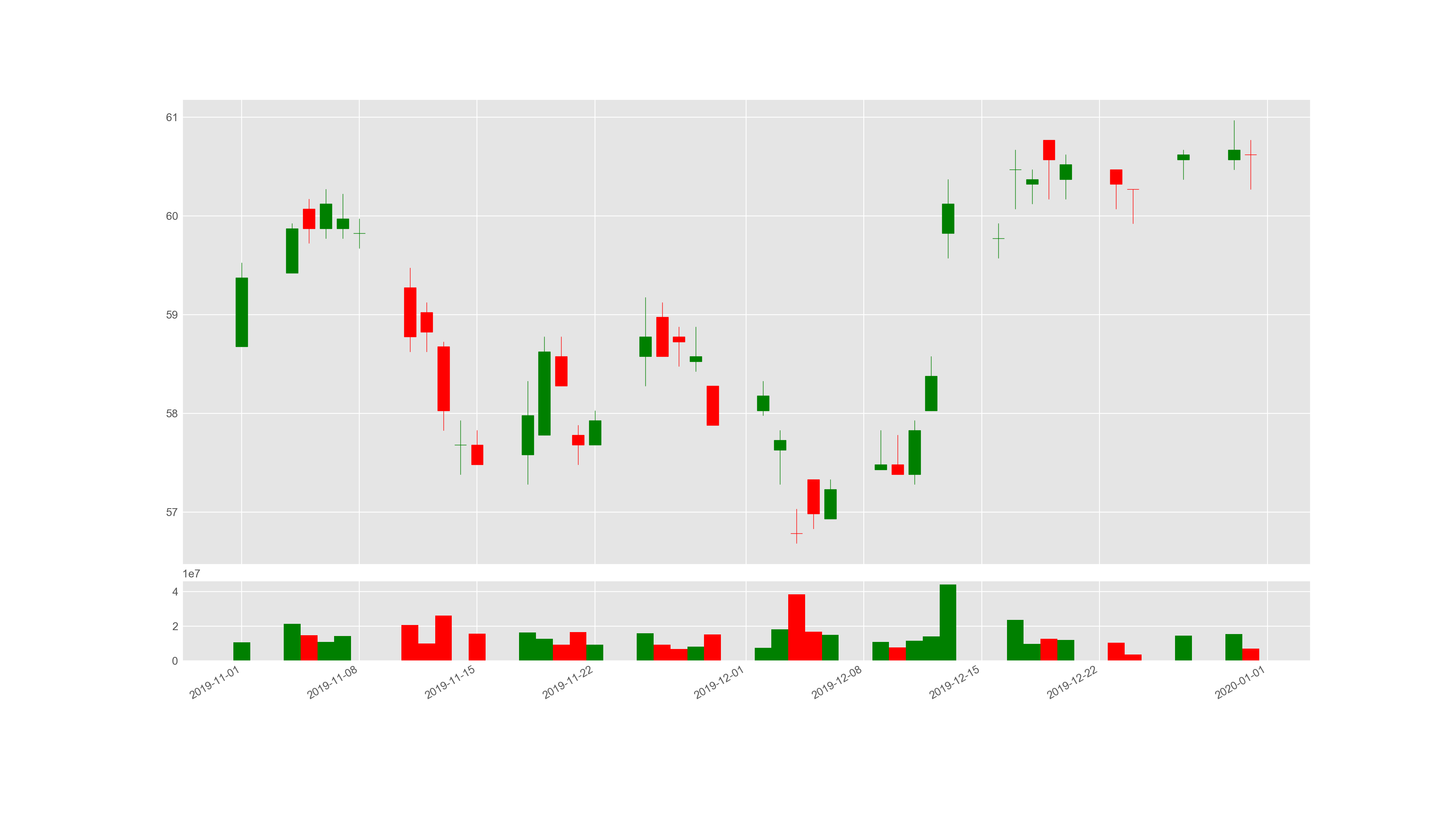
Example of a candlestick chart.
Scaling
Arithmetic scaling
Key points
On a linear scale, as the distance in the axis increases the corresponding value also increases linearly.
When the values of data fluctuate between extremely small values and very large values – the linear scale will miss out the smaller values thus conveying a wrong picture of the underlying phenomenon.
Semi-logarithmic scaling
Key points
On a logarithmic scale, as the distance in the axis increases the corresponding value increases exponentially.
With logarithmic scale, both smaller valued data and bigger valued data can be captured in the plot more accurately to provide a holistic view.
Therefore, semi-logarithmic charts can be of immense help especially when plotting long-term charts, or when the price points show significant volatility even in short-term charts. The underlying chart patterns will be revealed more clearly in semi-logarithmic scale charts.
plt.style.use('ggplot')

fig, (ax1, ax2) = plt.subplots(1, 2)
fig.set_size_inches(18.5, 7.0)

### Subplot 1 - Semi-logarithmic ###
plt.subplot(121)
plt.grid(True, which="both")

# Linear X axis, Logarithmic Y axis
plt.semilogy(df.index, df['Close'], 'r')
plt.ylim([10,500])

plt.xlabel("Date")
plt.title('Semi-logarithmic scale')
fig.autofmt_xdate()

### Subplot 2 - Arithmetic ###
plt.subplot(122)

plt.plot(df.index, df['Close'], 'b')

plt.xlabel("Date")
plt.title('Arithmetic scale')
fig.autofmt_xdate()

# show plot
plt.show()
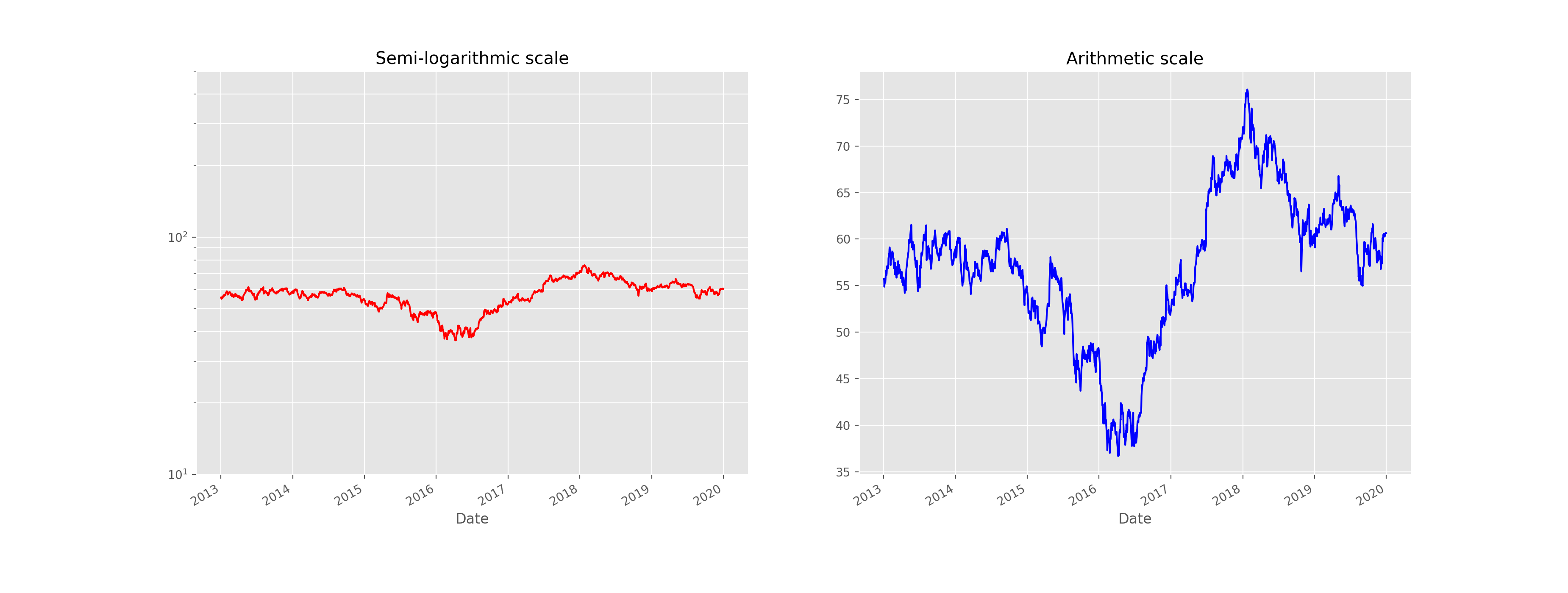
The same data plotted with semi-logarithmic and arithmetic scales.
Technical indicators
code/technical-analysis_python/ in
the repository.In general, there are 2 categories of indicators:
Leading - They give trade signals when the trend is about to started, hence they use shorter periods in their calculations. Examples are MACD and RSI.
Lagging - They follow the price action, and thus gives a signal after a trend or a reversal started. Examples are Moving Averages and Bollinger Bands.
Definition
# in terminal
cd code/technical-analysis_python
python main_macd_crossover.py # run macd in the backtester
Trend indicators
Definition
Moving Average Convergence Divergence (MACD)
One of the simplest strategy established with MACD, is to identify MACD crossovers. The rules are as follows.
Tip
Buy signal: MACD rises above the signal line
Sell signal: MACD falls below the signal line
It is easy to calculate the EMA with pandas:
# Get adjusted close column
close = self.df['Close']

exp1 = close.ewm(span=12, adjust=False).mean()
exp2 = close.ewm(span=26, adjust=False).mean()
df['MACD'] = exp1 - exp2
span specifies the time span, and adjust=False means the
exponentially weighted function is calculated recursively (as we do not need
a decaying adjustment factor for beginning periods).To plot the signal line:
df['Signal line'] = self.df['MACD'].ewm(span=9, adjust=False).mean()
Moving Averages (MA)
We could estalish a simple trading strategy making use of two moving averages:
Tip
Buy signal: shorter-term MA crosses above the longer-term MA (golden cross)
Sell signal: shorter-term MA crosses below the longer-term MA (dead/death cross)
Here is an example of how to plotting the two MAs:
# Create short simple moving average over the short window
signals['short_mavg'] = self.df['Close'].rolling(window=short_window, min_periods=1, center=False).mean()

# Create long simple moving average over the long window
signals['long_mavg'] = self.df['Close'].rolling(window=long_window, min_periods=1, center=False).mean()
short_window and long_window on our own, for example as setting
short_window = 40 and long_window = 40.And then we could generate signals based on the two line plots:
# Generate signals
signals['signal'][short_window:] = np.where(signals['short_mavg'][short_window:]
                                            > signals['long_mavg'][self.short_window:], 1.0, 0.0)

signals['positions'] = signals['signal'].diff()
Parabolic Stop and Reverse (Parabolic SAR)
(i) Rising SAR (Uptrend)
Prior SAR: The SAR value for previous period.
Extreme Point (EP): The highest high of the current uptrend.
Acceleration Factor (AF): Starting at 0.02, increases by 0.02 each time the extreme point makes a new high. AF can only reach a maximum of 0.2, no matter how long the uptrend extends.
(ii) Falling SAR (Downtrend)
Prior SAR: The SAR value for previous period.
Extreme Point (EP): The lowest low of the current downtrend.
Acceleration Factor (AF): Starting at 0.02, increases by 0.02 each time the extreme point makes a new low. AF can only reach a maximum of 0.2, no matter how long the downtrend extends.
We generate signals based on the rising and falling SARs.
Tip
Buy signal: if falling SAR goes below the price
Sell signal: if rising SAR goes above the price
array_high = list(df['High'])
array_low = list(df['Low'])
array_close = list(df['Close'])

psar = df['Close'].copy()
psarbull = [None] * len(df)
psarbear = [None] * len(df)

bull = True # flag to indicate saving value for rising SAR
af = initial_af # initialise acceleration factor
max_af = 0.2
ep = array_low[0] # extreme price
hp = array_high[0] # extreme high
lp = array_low[0] # extreme low
Then, traversing each row in the dataframe, we could calculate rising SAR and falling SAR at the same time:
for i in range(2, len(self.df)):
  if bull:
      # Rising SAR
      psar[i] = psar[i-1] + af * (hp - psar[i-1])
  else:
      # Falling SAR
      psar[i] = psar[i-1] + af * (lp - psar[i-1])

    reverse = False

    # Check reversion point
    if bull:
        if array_low[i] < psar[i]:
            bull = False
            reverse = True
            psar[i] = hp
            lp = array_low[i]
            af = initial_af
    else:
        if array_high[i] > psar[i]:
            bull = True
            reverse = True
            psar[i] = lp
            hp = array_high[i]
            af = initial_af

    if not reverse:
        if bull:
            # Extreme high makes a new high
            if array_high[i] > hp:
                hp = array_high[i]
                af = min(af + initial_af, max_af)

            # Check if SAR goes abov prior two periods' lows.
            # If so, use the lowest of the two for SAR.
            if array_low[i-1] < psar[i]:
                psar[i] = array_low[i-1]
            if array_low[i-2] < psar[i]:
                psar[i] = array_low[i-2]

        else:
            # Extreme low makes a new low
            if array_low[i] < lp:
                lp = array_low[i]
                af = min(af + initial_af, max_af)

            # Check if SAR goes below prior two periods' highs.
            # If so, use the highest of the two for SAR.
            if array_high[i-1] > psar[i]:
                psar[i] = array_high[i-1]
            if array_high[i-2] > psar[i]:
                psar[i] = array_high[i-2]

    # Save rising SAR
    if bull:
        psarbull[i] = psar[i]
    # Save falling SAR
    else:
        psarbear[i] = psar[i]
Momentum indicators
Commodity Channel Index (CCI)
The formula for calculating CCI is given as follow.
Typical Price (TP) = (High + Low + Close) / 3
Constant = 0.015
x = Window size (default set as 20)
SMA: Simple Moving Average
signals['Typical price'] = (df['High'] + df['Low'] + df['Close']) / 3

signals['SMA'] = signals['Typical price'].rolling(
                 window=self.window_size, min_periods=1, center=False).mean()

signals['mean_deviation'] = signals['Typical price'].rolling(
                            window=20, min_periods=1, center=False).std()
signals['CCI'] = (signals['Typical price'] - signals['SMA']) /
                 (self.constant * signals['mean_deviation'])
A simple strategy formulated by using CCI is (the thresholds only serve as examples:
Tip
Buy signal: when CCI surges above +100
Sell signal: when CCI plunges below -100
# Generate buy signal
signals.loc[signals['CCI'] > 100, 'signal'] = 1.0

# Generate sell signal
signals.loc[signals['CCI'] < -100, 'signal'] = -1.0
Relative Strength Index (RSI)
where Average Gain and Average Loss are calculated as follows:
In the dataset, we need to extract gains and losses from the price column respectively:
# Get adjusted close column
close = df['Close']

# Get the difference in price from previous step
delta = close.diff()
# Get rid of the first row
delta = delta[1:]

# Make the positive gains (up) and negative gains (down) series
up, down = delta.copy(), delta.copy()
up[up < 0] = 0
down[down > 0] = 0
To calculate RS, as well as RSI:
# Calculate SMA using 'rolling' function
roll_up = up.rolling(window_size).mean()
roll_down = down.abs().rolling(window_size).mean()

# Calculate RSI based on SMA
RS = roll_up / roll_down
RSI = 100.0 - (100.0 / (1.0 + RS))
Tip
Oversold: when RSI crosses the lower threshold (e.g. 30)
Overbought: when RSI crosses the upper threshold (e.g. 70)
Rate of Change (ROC)
As you could see from above, it’s just the simple percentage change formula.
We could identify overbought and oversold conditions using ROC:
Tip
Oversold: when ROC crosses the lower threshold (e.g. -30)
Overbought: when ROC crosses the upper threshold (e.g. +30)
And here is one of the possible ways to calculate ROC:
n = 12 # set time period

diff = df['Close'].diff(n - 1)

# Calculate closing price n periods ago
closing = self.df['Close'].shift(n - 1)

df['ROC'] = (diff / closing) * 100
Stochastic Oscillator (STC)
Lowest Low = lowest low for the look-back period
Highest High = highest high for the look-back period
Note that in the formula %K is multiplied by 100 so as to move the decimal point by two places.
array_highest = [0] * length # store highest highs
for i in range(k - 1, length):
    highest = array_high[i]
    for j in range(i - 13, i + 1): # k-day lookback period
        if array_high[j] > highest:
            highest = array_high[j]
    array_highest[i] = highest

array_lowest = [0] * length # store lowest lows
for i in range(k - 1, length):
    lowest = array_low[i]
    for j in range(i - 13, i + 1): # k-day lookback period
        if array_low[j] < lowest:
            lowest = array_low[j]
    array_lowest[i] = lowest
# find %K line values
kvalues = [0] * length

for i in range(self.k - 1, length):
    k = ((array_close[i] - array_lowest[i]) * 100) / (array_highest[i] - array_lowest[i])
    kvalues[i] = k

df['%K'] = kvalues

# find %D line values
df['%D'] = df['%K'].rolling(window=3, min_periods=1, center=False).mean()
Tip
Buy signal: when %K line crosses above the %D line
Sell signal: when %K line crosses below the %D line
True Strength Index (TSI)
(i) Double Smoothed Price Change (PC)
PC = Current Price - Prior Price
First Smoothing = 25-period EMA of PC
Second Smoothing = 13-period EMA of 25-period EMA of PC
(ii) Double Smoothed Absolute Price Change (PC)
Absolute Price Change | PC | = Absolute Value of Current Price minus Prior Price
First Smoothing = 25-period EMA of | PC |
Second Smoothing = 13-period EMA of 25-period EMA of | PC |
Based on the above formulae, the code is shown as follow:
df['Double Smoothed PC'] = pc.ewm(span=25, adjust=False).mean().ewm(
                                span=13, adjust=False).mean()

df['Double Smoothed Abs PC'] = abs(pc).ewm(span=25, adjust=False).mean().ewm(
                                    span=13, adjust=False).mean()

df['TSI'] =  df['Double Smoothed PC'] / df['Double Smoothed Abs PC'] * 100
In order to interpret the TSI, we could define a signal line:
And we could observe signal line crossovers:
Tip
Buy signal: when TSI crosses above the signal line from below
Sell signal: when TSI crosses below the signal line from above
Money Flow Index (MFI)
It is pretty straightforward to calculate typical price:
# Typical price
tp = (df['High'] + df['Low'] + df['Close']) / 3.0
# positive = 1, negative = -1
self.df['Sign'] = np.where(tp > tp.shift(1), 1, np.where(tp < tp.shift(1), -1, 0))

# Raw money flow
df['Money flow'] = tp * df['Volume'] * df['Sign']

# Positive money flow with n periods
n_positive_mf = df['Money flow'].rolling(n).apply
                (lambda x: np.sum(np.where(x >= 0.0, x, 0.0)), raw=True)

# Negative money flow with n periods
n_negative_mf = abs(df['Money flow'].rolling(self.n).apply
                (lambda x: np.sum(np.where(x < 0.0, x, 0.0)), raw=True))
With the money flows, it would be easy to compute the MFI:
mf_ratio = n_positive_mf / n_negative_mf
df['MFI'] = (100 - (100 / (1 + mf_ratio)))
By way of example, we could use MFI to identify overbought and oversold conditions:
Tip
Oversold: when MFI crosses the upper threshold
Overbought: when MFI crosses the lower threshold
William %R
Lowest Low = lowest low for the look-back period
Highest High = highest high for the look-back period
The code for implementing %R is shown as follows:
lbp = 14 # set lookback period

hh = df['High'].rolling(lbp).max()  # highest high over lookback period
ll = df['Low'].rolling(lbp).min()  # lowest low over lookback period
df['%R'] = -100 * (hh - df['Close']) / (hh - ll)
Similarly, we could use %R to identify overbought and oversold conditions:
Tip
Oversold: when %R goes below -80
Overbought: when %R goes above -20
Volatility indicators
Bollinger Bands
window = 20

# Compute middle band
df['Middle band'] = self.df['Close'].rolling(window).mean()

# Compute 20-day s.d.
mstd = df['Close'].rolling(window).std(ddof=0)
# Computer upper and lower bands
df['Upper band'] = df['Middle band']  + mstd * 2
df['Lower band'] = df['Middle band']  - mstd * 2
Tip
Buy signal: when price goes below lower band
Sell signal: when price goes above upper band
Average True Range
1st True Range (TR) value = High - Low
1st n-day ATR = average of the daily TR values for the last n days
array_high = list(df['High'])
array_low = list(df['Low'])

tr = [None] * len(df) # initialisation

for i in range(len(df)):
    tr[i] = array_high[i] - array_low[i]
atr = [None] * len(self.df) # initialisation
window = 14

atr[15] = sum(tr[0:15]) / window
for i in range(16,len(self.df)):
    atr[i] = (atr[i-1] * (window-1) + tr[i]) / window
Tip
We could use ATR to filter out stocks that are highly volatile.
Standard Deviation
As an example, we could set window=21:
window = 21
df['SD'] = df['Close'].rolling(window).std(ddof=0)
Tip
We could use Standard Deviation to measure the expected risk of stocks.
Volume indicators
Chaikin Oscillator
df['MFM'] = ((df['Close'] - df['Low']) - df['High'] - df['Close'])
            / (df['High'] - df['Low'])
df['MFV'] = df['MFM'] * df['Volume']
df['ADL'] = df['Close'].shift(1) + df['MFV']

short_w = 3
long_w = 10
ema_long = df['ADL'].ewm(ignore_na=False, min_periods=0, com=short_w, adjust=True).mean()
ema_short = df['ADL'].ewm(ignore_na=False, min_periods=0, com=long_w, adjust=True).mean()

df['Chaikin'] = ema_short - ema_long
Tip
Buy signal: when the oscillator is positive
Sell signal: when the oscillator is negative
On-Balance Volume (OBV)
The formula for OBC changes according to the following 3 cases:
1) If closing price > prior close price:
2) If closing price < prior close price:
3) If closing price = prior close price then:
We could traverse the dataframe, and use if-else statements to capture the 3 conditions:
obv = [0] * len(self.df) # for storing the on-balance volume

array_close = list(df['Close'])
array_volume = list(df['Volume'])

for i in range(1, len(self.df)):
    if (array_close[i] > array_close[i-1]):
        obv[i] = obv[i-1] + array_volume[i]
    elif (array_close[i] < array_close[i-1]):
        obv[i] = obv[i-1] - array_volume[i]
    else:
        obv[i] = obv[i-1]
Tip
A rising OBV reflects positive volume pressure that can lead to higher prices
A falling OBV reflects negative volume pressure that can foreshadow lower prices
Volume Rate of Change
The way of calculating Volume ROC is similar to ROC:
n = 25 # example time period
df['Volume ROC'] = ((df['Close'] - df['Close'].shift(n)) /
                    df['Close'].shift(n))
Here is a simple example strategy based on Volume ROC:
Tip
Buy signal: if Volume ROC goes below zero
Sell signal: if Volume ROC is negative
References
Image sources
Attention